
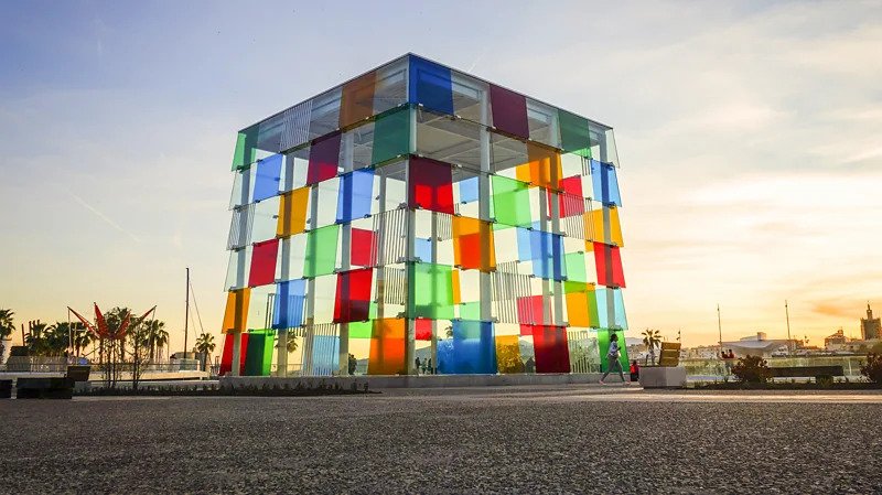
Colour has played a major role in architecture for thousands of years, from pigments used on ancient surfaces to the painted temples, stained glass and decorative buildings that followed. Today, architects continue to use colour to give buildings a stronger identity and create distinctive experiences for the people who use them.
A new book, Chromatic Architecture: The Craft of Colour in Design, examines the role of colour in architectural design through 34 projects from different periods and parts of the world. Written by artist and designer Adam Nathaniel Furman and journalist Kate Mazade, the book looks at colour as an important part of architecture rather than simply a decorative finish.
Among the projects featured are religious buildings, public spaces, residential developments, commercial buildings and industrial facilities. Eight examples show how dramatically colour can change the appearance and character of architecture.
1. Sri Ranganatha Swamy Temple, Tamil Nadu, India
The Sri Ranganatha Swamy Temple in Tamil Nadu is one of the most visually striking examples of colourful religious architecture featured in the book.
The temple complex developed over many centuries and is known for its large gateways, known as gopurams. These gateways are covered with detailed sculptural elements and bright colours, creating a highly decorative appearance.
The use of colour is closely connected to the temple’s religious and cultural character. Rather than simply covering a plain structure with paint, the colours work together with sculpture and architectural detail to create an environment designed to inspire visitors and worshippers.
The temple is part of Tamil Nadu’s long tradition of using vivid colour in religious architecture.
Barcelona’s Palau de la Música Catalana was completed in 1908 and designed by architect Lluís Domènech i Montaner.
The concert hall combines several architectural influences, including Catalan modernism, Gothic Revival elements and decorative traditions inspired by other cultures. Its interior and exterior feature extensive ornamentation, including colourful stonework, ceramics, glass and sculptural details.
The building became an important expression of Catalonia’s cultural identity during a period of industrial and cultural development.
Its detailed surfaces show how colour can work alongside architectural form to create a building that feels visually rich from almost every angle.
3. Guardian Building, Detroit, USA
The Guardian Building in Detroit opened in 1929 and is one of the city’s best known examples of Art Deco architecture.
Designed by Wirt C. Rowland, the building is sometimes called Detroit’s “Cathedral of Finance”. Its exterior uses orange tinted brick and terracotta, while the interior features an elaborate main lobby with colourful tiles and a three storey vaulted ceiling.
The building’s decorative programme reflects the craftsmanship of the Great Lakes region during the early 20th century.
Its extensive use of colour also helped communicate the importance of Detroit as a major centre of American business and industry at the time.
4. De Bijenkorf Department Store, Eindhoven, Netherlands
Italian architect and designer Gio Ponti designed the De Bijenkorf department store in Eindhoven, which was completed in 1969.
The large building presented a challenge because much of its exterior was relatively closed and lacked conventional windows. Ponti responded with a strong geometric treatment that gave the structure a distinctive visual identity.
The source material for the book describes the building’s green appearance as resembling an emerald field. It transformed what could have been an ordinary concrete commercial building into a memorable piece of modern architecture.
The project demonstrates how colour and surface treatment can change the way people perceive a large urban structure.
5. Reversible Destiny Lofts, Tokyo, Japan
The Reversible Destiny Lofts in Tokyo were completed in 2005 and designed by Shusaku Arakawa and Madeline Gins.
The unusual residential complex combines brightly coloured architectural forms, including spheres, cylinders and cuboids. The interiors also contain uneven floors and unusual room arrangements.
Arakawa and Gins intended the environment to challenge residents rather than provide a conventional and predictable living space.
The architects believed that an environment could encourage people to remain physically and mentally active. Colour forms an important part of that unusual approach, creating a residential setting that looks very different from a traditional apartment building.
6. Maishima Waste Incinerator Plant, Osaka, Japan
The Maishima Waste Incinerator Plant in Osaka shows how colour can also transform an industrial facility.
The project was redesigned by Austrian artist and architect Friedensreich Hundertwasser, who was known for rejecting the rigid geometric forms associated with conventional modern architecture.
Construction took place between 1997 and 2001, and the plant opened in May 2001. Hundertwasser redesigned the facility and its 120 metre chimney as part of the Maishima Island Project.
The building features colourful walls, strong geometric patterns and distinctive architectural forms. Its appearance stands in sharp contrast to the plain industrial structures commonly associated with waste processing.
The project reflects Hundertwasser’s belief that functional buildings could also have artistic and human qualities.
7. Leganés Central Library, Leganés, Spain
The Leganés Central Library and Municipal Archive was completed in 2019 by BN Asociados Arquitectos.
Its rounded exterior is covered with pastel ceramic elements that give the building a soft and distinctive appearance. The design uses the building’s form and surface to create a visual connection with the books and cultural material housed inside.
The library also serves as a landmark in its surrounding urban area.
The changing effect of sunlight across the ceramic surface adds another dimension to the building. Its pastel colours can appear similar to sheets of paper, reinforcing the connection between the building’s appearance and its purpose.
8. Croydon Colonnade, London, UK
The Croydon Colonnade in south London was designed by Adam Nathaniel Furman and completed in 2023.
The public space features 16 large columns and walls covered with three dimensional porcelain tiles. Furman’s project page describes the colonnade as a new pedestrian route and notes that completion took place in autumn 2023.
The tiles create a strong colour gradient, moving from deep blue at the lower sections towards white above. The surface also has a tactile quality that makes the structure different from a conventional painted wall.
The project was recognised as one of the notable architectural works of 2023, and Furman’s studio lists awards for the project in 2024.
Why Colour Matters in Architecture
The buildings featured in Chromatic Architecture show that colour can influence architecture in many different ways.
At a religious site such as the Sri Ranganatha Swamy Temple, colour contributes to a highly decorative and spiritual environment. At the Guardian Building, it forms part of an Art Deco expression of craftsmanship and commercial power.
In more contemporary examples, colour can help transform industrial, residential and public spaces. The Maishima Waste Incinerator Plant demonstrates that even a functional facility can become visually distinctive, while the Reversible Destiny Lofts use colour as part of an unusual approach to residential design.
The book argues for treating colour as an important architectural material and design tool. Its examples span historical and contemporary buildings and show how colour can help communicate cultural identity, shape public spaces and change people’s experience of the built environment.
About Chromatic Architecture
Chromatic Architecture: The Craft of Colour in Design is written by Adam Nathaniel Furman and Kate Mazade and published by RIBA Publishing.
The publisher describes the book as an exploration of how colour is incorporated into buildings and how it can express cultural and material identity. The book contains 208 pages and features 34 architectural projects from different periods and locations.
The book is scheduled for publication on 1 September 2026.
From an ancient temple in India to a modern pedestrian space in London, the eight buildings demonstrate the wide range of ways architects and designers can use colour. Chromatic Architecture brings these examples together to show how colour can become a central part of architectural identity, history and human experience.